 Оффлайн
- Регистрация
- 9 Май 2015
- Сообщения
- 1,483
- Баллы
- 155
Intro
The latest sample demonstrates how to add custom header and footer buttons to the powerful TTMSFNCDataGrid, enabling enhanced user interaction directly within the grid interface. From search capabilities to sorting control and data grouping toggles, these buttons make interacting with grid data easier than ever. And yes, they seamlessly adapt to light and dark mode. Let's dive into how you can implement and use them effectively!
What is TMS FNC Data Grid?
To have a better understanding on what is and has to offer, please read through first.
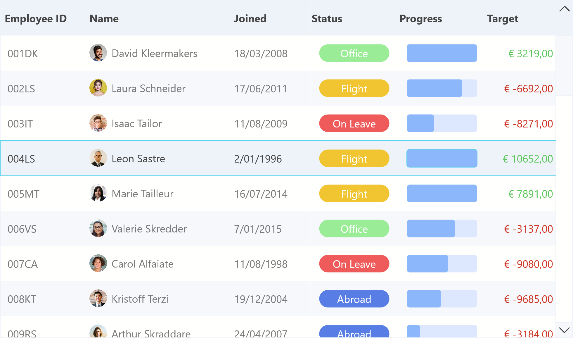
Interactive Buttons in Header and Footer
TTMSFNCDataGrid supports embedding buttons / custom controls in its header and footer, giving developers the power to create personalized UI experiences.
Header Buttons
To add header buttons we can use the following code:
var
Btn: TTMSFNCDataGridButton;
begin
Btn := TMSFNCDataGrid1.Header.Bar.Buttons.Add;
Btn.Text := 'Calculations';
Btn.OnClick := OnHeaderButtonClick;
These buttons will appear aligned at the top of the grid and automatically adjust their appearance based on the active theme.
Footer Buttons
At the bottom of the grid, we can add a search bar and search button using:
Edit := TEdit.Create(Self);
Edit.Parent := Self;
Edit.Prompt := 'Type in your search query';
TMSFNCDataGrid1.Footer.Bar.Buttons.Add.Control := Edit;
Btn := TButton.Create(Self);
Btn.Parent := Self;
Btn.Text := 'Search';
Btn.OnClick := OnSearchClick;
TMSFNCDataGrid1.Footer.Bar.Buttons.Add.Control := Btn;
This approach makes it easy to implement user-defined data querying directly within the grid.
Dark & Light themes
One of the major advantages of using TTMSFNCDataGrid is its built-in styling awareness, which has been improved in the latest TMS FNC UI Pack update. The buttons added to the header and footer automatically adapt to theme changes as well as the built-in icons for actions such as as sorting & filtering. Set the AdaptToStyle property to true to see the applied style coming through.
Whether you're using the grid in light mode or switching to dark mode, all controls retain clarity and consistency without extra styling code. (Used theme: FMX Copper Style)
Conclusion
Header and footer buttons in TTMSFNCDataGrid offer a convenient and stylish way to interact with your data. Whether its filtering, sorting, expanding/collapsing groups, or providing a search interface, this functionality lets you bring control closer to the user.

The latest sample demonstrates how to add custom header and footer buttons to the powerful TTMSFNCDataGrid, enabling enhanced user interaction directly within the grid interface. From search capabilities to sorting control and data grouping toggles, these buttons make interacting with grid data easier than ever. And yes, they seamlessly adapt to light and dark mode. Let's dive into how you can implement and use them effectively!
What is TMS FNC Data Grid?
To have a better understanding on what is and has to offer, please read through first.
Interactive Buttons in Header and Footer
TTMSFNCDataGrid supports embedding buttons / custom controls in its header and footer, giving developers the power to create personalized UI experiences.
Header Buttons
To add header buttons we can use the following code:
var
Btn: TTMSFNCDataGridButton;
begin
Btn := TMSFNCDataGrid1.Header.Bar.Buttons.Add;
Btn.Text := 'Calculations';
Btn.OnClick := OnHeaderButtonClick;
These buttons will appear aligned at the top of the grid and automatically adjust their appearance based on the active theme.
Footer Buttons
At the bottom of the grid, we can add a search bar and search button using:
Edit := TEdit.Create(Self);
Edit.Parent := Self;
Edit.Prompt := 'Type in your search query';
TMSFNCDataGrid1.Footer.Bar.Buttons.Add.Control := Edit;
Btn := TButton.Create(Self);
Btn.Parent := Self;
Btn.Text := 'Search';
Btn.OnClick := OnSearchClick;
TMSFNCDataGrid1.Footer.Bar.Buttons.Add.Control := Btn;
This approach makes it easy to implement user-defined data querying directly within the grid.
Dark & Light themes
One of the major advantages of using TTMSFNCDataGrid is its built-in styling awareness, which has been improved in the latest TMS FNC UI Pack update. The buttons added to the header and footer automatically adapt to theme changes as well as the built-in icons for actions such as as sorting & filtering. Set the AdaptToStyle property to true to see the applied style coming through.
Whether you're using the grid in light mode or switching to dark mode, all controls retain clarity and consistency without extra styling code. (Used theme: FMX Copper Style)
Conclusion
Header and footer buttons in TTMSFNCDataGrid offer a convenient and stylish way to interact with your data. Whether its filtering, sorting, expanding/collapsing groups, or providing a search interface, this functionality lets you bring control closer to the user.
Источник: